
How an AI Image Editor Refreshes a Decade of Recipe Photos Without Recooking
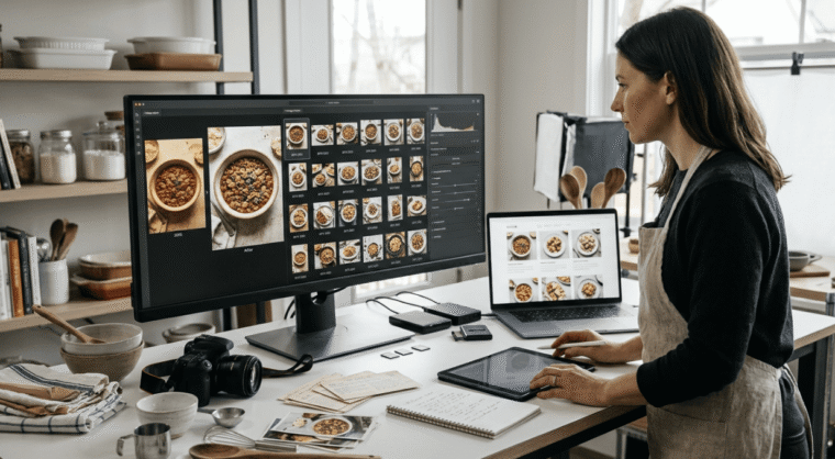
A blog that has been running for years has one asset larger than everything else, and it is not the post published this week.
It is the archive. Recipes from four years ago that still turn up in search, pins saved in 2021 that still send traffic, a slow cooker post from a January nobody remembers that quietly outperforms half of what has been published since.
Those posts are still working, and they are working with photographs taken on an older phone, in a kitchen with different lighting, at dimensions that made sense when they were uploaded.
Recooking a hundred recipes to fix that is not a plan. Running the photographs through an AI Image Editor with practical workflows through Higgsfield and this covers how far that goes and where it stops.
Why does an old post gradually stop performing?
Rarely because the recipe stopped being good.
The content is usually fine. A method that worked in 2021 works now, and the writing around it has not deteriorated. What has changed is everything surrounding it.
Competing posts got better photographs. Somebody published the same dish more recently with brighter, larger images, and on a results page or a feed full of thumbnails that difference decides which one gets the click.
Display expectations moved. Images uploaded at a width that suited a blog theme from years ago now look small on a large screen and soft on a phone.
And the visual style of the whole category shifted. Food photography conventions change, and a post that looked current when published gradually starts to look like it was taken in a particular year.
None of that requires new content. It requires the existing images to be brought up to where readers now expect them.
What exactly makes a photograph look its age?
Four things, and all four are technical rather than compositional.
Size. Images uploaded years ago were saved smaller because page speed mattered more and screens were smaller. Enlarging them now produces softness.
Colour. Older phone cameras handled indoor light worse, particularly the yellow cast of a kitchen in the evening, and the food underneath looks duller than it was.
Noise and softness, from sensors that struggled in anything other than daylight.
And ratio. Images shot and cropped for a layout from years ago frequently do not fit current post templates, feeds or pin dimensions, so they end up letterboxed or badly cropped.
Every one of those is fixable in an AI Image Editor without the food being anywhere near a camera again.
How much traffic actually sits in the archive?
More than most bloggers assume until they look properly.
Search traffic accumulates rather than spikes. A recipe post published years ago that has settled into a stable position keeps earning, quietly, every month, and collectively those posts frequently outweigh recent publishing by a wide margin.
Saved pins compound. Something saved by enough people in a previous year continues circulating without any further effort, which is why the highest-performing pin on many accounts is several years old.
And seasonal posts return annually. A holiday recipe or a back-to-school piece does nothing for eleven months and then does a great deal, every year, on schedule.
The practical implication is straightforward. Effort spent improving what already ranks reaches more people than the same effort spent on something new, because the audience is already arriving.
Which posts deserve the attention first?
Not the oldest, and not the ones with the worst photographs.
Start with the highest traffic. Whichever posts already bring the most readers are where a better image changes the most outcomes, regardless of how good or bad the photography currently is.
Then the seasonal ones, ahead of their season. A holiday recipe refreshed in September is refreshed in time to matter. The same work done in December is a year early for the next cycle.
Then anything close to ranking well but not quite there, where presentation may be part of what separates it from the posts above it.
And leave alone anything genuinely dormant. A post nobody finds will not start being found because its photographs improved, and the time is better spent elsewhere.
What can an AI Image Editor change about a photo from years ago?
The conditions it was taken and saved under, which is most of what dates it.
Size and sharpness, bringing a small uploaded image up to something that holds at current display widths.
AI Image Editor colour correction, particularly removing the yellow cast that indoor evening light puts over everything. This is the single change that does most for food, because warm casts make cooked dishes look flat and tired.
Noise reduction, on anything photographed in a dim kitchen with an older camera.
Reframing to current ratios in the AI Image Editor, producing the shapes a post template, a feed and a pin each need from one source.
And consistency across a set, so a post carrying six step photographs from one session no longer shows the light changing between them.
An AI Image Editor handles all of that as a batch, which is the only way a hundred-post refresh is realistic rather than theoretical.
What stays beyond reach?
Anything that was decided when the shutter went.
Composition. What is in frame, where it sits, what angle it was taken from. A photograph looking down at a plate cannot become one taken from the side.
Focus. Something soft because the camera focused on the wrong thing stays soft.
Styling. The plate, the surface, the napkin, whether anything was garnished. All fixed at the time.
And whatever was not photographed at all. A recipe with one finished shot and no process images still has one finished shot afterwards.
Which is useful to know before starting, because it shapes the sorting. Posts where the original photographs are technically poor but well composed are the ones worth processing. Posts where the shot itself was wrong are candidates for recooking one day, not for a refresh pass.
Where does the line sit on budget food?
Closer than it does for most food photography, and it matters more here than almost anywhere.
A frugal recipe blog runs on trust. A reader cooks something on the strength of the picture, and if what arrives on their plate looks markedly different from what they were shown, they do not blame the lighting. They conclude the blog oversells, and that conclusion applies to everything else on the site.
So AI Image Editor corrections restore rather than improve. Removing a yellow cast so a dish looks the colour it actually was is accurate. Warming and saturating it until it looks richer than anything the ingredients could produce is not.
Never add what is not in the recipe. A garnish, a richer sauce, a browner crust. If the picture shows it, the method should produce it.
And leave the honest signals in. Budget cooking looks like budget cooking. Simple plating, ordinary crockery, portions that suit a family. Those details are the reason the reader trusts the post, and removing them removes the point.
The test worth applying: would somebody who cooked this recognise their own result. If yes, the editing restored the photograph. If no, it has started making a promise the recipe cannot keep.
How do the pins get refreshed at the same time?
As part of the same pass, which is where the effort compounds.
Old pins are usually the wrong shape. Pin dimensions and conventions have shifted, and graphics made years ago sit awkwardly in current feeds.
They also carry old text treatments, which is fine for something still circulating and unhelpful for anything being freshly pinned.
Producing new pin images from a corrected photograph is a straightforward AI Image Editor export once the underlying image has been improved, and it gives an old post something new to circulate without anything about the post changing.
Several per post rather than one, since that is standard practice and costs almost nothing once the source is right.
And the seasonal ones benefit most, because a refreshed pin going out ahead of the season reaches people at the moment they are looking.
What does a refreshed archive do for a brand approach?
Something worth knowing, because it changes what the work is for.
Brands look at old posts as well as recent ones. Anybody assessing a blog for a partnership browses around, and a visitor landing on a four year old recipe forms an impression from it exactly as they would from this week’s. An archive that looks consistent reads as a professional operation rather than a long-running hobby.
Media kits draw on the archive too. The examples a blogger sends are frequently the best-performing posts, which are usually the older ones, and those images are what a brand actually sees first.
And the highest-traffic posts are the ones being pitched. A brand interested in placement on a recipe that already earns well is looking at photographs taken years ago on a phone that is now two generations old.
Running those through an AI Image Editor before a media kit goes out costs an evening and changes the first impression of the whole site, which is a better return than most things a blogger could spend that evening on.
Higgsfield keeping the treatment stored means posts refreshed for one pitch stay refreshed, and anything added later matches without another decision. Over a year that produces a site reading as one body of work rather than as a decade of different phases.
What does a workspace need for a set this size?
Batch handling above everything, since the whole exercise is volume.
Higgsfield is an AI creative suite, which here means the corrections, the reframing and the exports happen in one browser tab rather than across several tools.
Processing groups together is the mechanism. Photographs from the same period and the same camera respond to the same AI Image Editor treatment, so grouping by year rather than by recipe is considerably faster than working post by post.
A saved Higgsfield treatment keeps the archive coherent. Once the correction is settled, every subsequent batch inherits it, which means a refreshed post from 2020 and a new post from this month look like they belong to the same blog.
Higgsfield keeps originals separate from corrected versions, which matters because the untouched file is the record of what was actually photographed.
Every ratio from one corrected source in Higgsfield, covering the post, the feed and the pins without reprocessing.
And browser access, which suits work done in pieces over several evenings rather than in one sitting.
How long does a hundred-post refresh actually take?
A few evenings, spread out, and considerably less than the first evening suggests.
Pull the traffic report first and list the posts in order of readers rather than by date. This takes twenty minutes and determines everything else.
Take the top ten and gather their images, including any originals still on a drive, since those are larger than what was uploaded.
Correct one properly in an AI Image Editor, until it looks right at the size a reader will actually see it.
Apply that AI Image Editor treatment to the batch, then check each against the original rather than against memory.
Replace the images on the posts, produce the pin variations, and note the date of the refresh somewhere.
Then stop and watch. Give it a few weeks before doing the next ten, because the numbers will tell you whether it was worth continuing and which kinds of posts responded.
Conclusion
The posts earning the most on a long-running blog were mostly published years ago, photographed on whatever phone was current, and uploaded at a size that suited a theme nobody uses anymore.
An AI Image Editor fixes the size, the colour and the noise across a batch, and Higgsfield stores the treatment so a post from 2020 sits comfortably beside one from this week.
What it does not do is change the dish. Correct the cast, keep the plating ordinary, and make sure the picture still shows what a reader will actually put on the table.
